

10 Wall Shelf Placement Mistakes That Make Your Room Feel Smaller
The article lists ten wall shelf placement mistakes that make rooms feel smaller, including hanging shelves too low or too high, overloading one wall, ignoring alignment with furniture, choosing bulky shelves for small spaces, blocking natural light, and adding shelves as afterthoughts. It argues that spacing, proportion, and restraint matter more than maximizing storage.
Wooden wall shelves are usually added with a good intention — to save space, keep things organized, and make a room feel more complete.
But in many cases, the opposite happens.
A poorly placed shelf can make a room feel tighter, heavier, and more cluttered than before. Even a well-designed shelf won’t work if the placement is off.
The difference between a shelf that improves a room and one that disrupts it is often just a few centimeters, or a small decision made during installation.
Here are the most common wall shelf placement mistakes — and what actually works better.
1.Hanging Shelves Too Low
One of the most common mistakes is placing a shelf too close to the furniture below it.
It often happens when trying to “connect” the shelf with a sofa, desk, or bed — but instead of creating a cohesive look, it compresses the space.
When the gap is too small, everything starts to feel like one heavy block. There’s no separation between elements, which makes the room feel visually dense and slightly uncomfortable.
This is especially noticeable in smaller rooms, where every bit of vertical space matters.
A better approach is to allow enough breathing room between the shelf and the furniture. Even increasing the distance slightly can make the entire wall feel more open and balanced. The shelf becomes its own element rather than something squeezed into the layout.

2. Placing Shelves Too High (Out of Reach and Out of Balance)
Going too high creates a different kind of imbalance.
Shelves placed close to the ceiling tend to feel disconnected from the rest of the room, almost like they were added just to fill empty space.
They also lose their functionality. Items placed there are harder to reach, so the shelf becomes purely decorative — and often not in a way that feels intentional.
Visually, this pulls attention upward without anchoring it anywhere, which can make the room feel slightly awkward rather than cohesive.
Keeping shelves within a comfortable line of sight helps them feel integrated into the space. They should relate to the furniture and the overall layout, not float separately above it.

3. Overloading One Wall
When storage is limited, it’s tempting to use one wall for everything — adding multiple shelves, stacking them vertically, or spreading them across the entire surface.
While this might increase storage, it often comes at the cost of visual clarity.
Too many shelves in one area create visual weight. The wall starts to feel busy, and instead of looking organized, it looks crowded. This effect is even stronger when each shelf is filled with items.
What makes shelves work well is not just their function, but the space around them. Empty areas give structure to what is placed.
Spacing shelves thoughtfully and limiting their number usually creates a cleaner, more intentional result — even if it means slightly less storage.

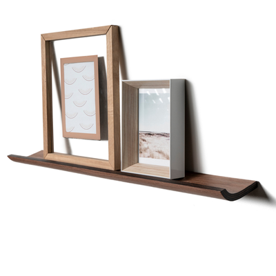
4. Ignoring Alignment With Furniture
Alignment is one of those details that people notice without realizing why something feels off.
A shelf that is slightly too short, too long, or not centered with the furniture below it can disrupt the balance of the entire wall. Even small misalignments can create a sense of inconsistency.
For example, a shelf above a sofa that doesn’t match the sofa’s width or position can look accidental rather than designed.
A more considered approach is to use the furniture as a reference point. The shelf can either align with it or intentionally contrast in a clear way — but it should never feel random.
When alignment is right, the entire setup feels more stable and visually calm.
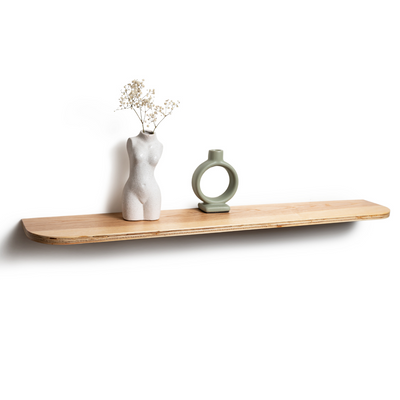
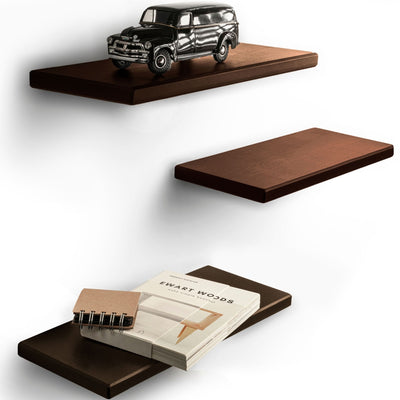
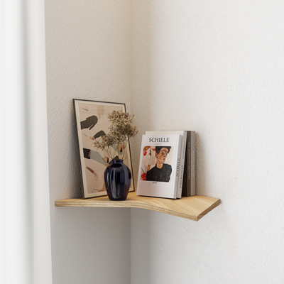
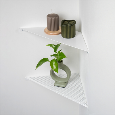
5. Choosing Bulky Shelves for Small Spaces
In smaller rooms, the physical size of a shelf matters more than expected.
Thick, deep, or visually heavy shelves can dominate the wall and make the space feel more enclosed. Instead of blending into the room, they stand out too much and add weight where it’s not needed.
This doesn’t mean shelves should be minimal to the point of being fragile — but their proportions should match the scale of the room.
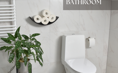
Slimmer profiles and wall-mounted designs tend to feel lighter visually. They provide function without overwhelming the space, which is especially important in bedrooms, bathroom

6. Blocking Natural Light
Natural light plays a major role in how spacious a room feels.
Placing shelves too close to windows, or directly in the path of light, can reduce brightness more than expected. Even partially blocking a light source can create shadows and make the room feel smaller and less open.
This is often overlooked because the shelf itself seems small, but its position affects how light spreads across the space.
Keeping shelves away from main light sources — or choosing more open, less bulky designs — helps maintain that sense of openness.
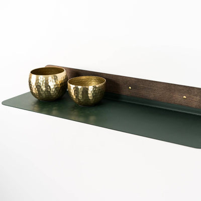
7. Using Shelves as Storage Dumping Zones
Even a perfectly placed shelf can lose its effect if it’s overloaded.
When shelves become a place to put “a bit of everything,” they quickly turn into visual clutter. Different objects, colors, and shapes compete for attention, making the space feel less organized.
This often happens gradually — adding one item at a time until the shelf feels full.
A more effective approach is to be selective. A few well-chosen objects create a cleaner and more intentional look. Leaving some space empty is not wasted space — it’s what allows the items to stand out.
8. Not Considering Wall Type and Stability
Placement is not only about where the shelf looks good, but also where it can actually work long-term.
Different wall types require different mounting methods. A shelf installed in drywall without proper anchors may look fine at first, but over time it can loosen, tilt, or start to sag.
This affects both safety and appearance.
Planning the installation properly — choosing the right fixings and understanding the wall structure — ensures that the shelf remains stable and maintains its position.
A stable shelf always looks better than one that shifts or feels insecure.
9. Treating Shelves as Afterthoughts
Shelves are sometimes added at the end of the process — once everything else is in place.
While this seems logical, it often leads to placements that feel random or disconnected. The shelf fills a gap, but doesn’t truly belong in the layout.
This is when shelves feel more like decoration than part of the design.
Thinking about shelves earlier, as part of the overall arrangement, leads to better results. They can support the layout instead of interrupting it.
10. Filling Every Wall Just Because You Can
It’s easy to assume that every empty wall should be used.
But in reality, leaving some areas untouched is what creates balance in a room.
When every wall has something on it, the space starts to feel overwhelming. There’s no place for the eye to rest, and even well-designed elements lose their impact.
Using fewer shelves, placed thoughtfully, often creates a stronger result than trying to maximize every surface.
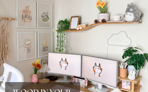
A Better Way to Think About Wall Shelves
A shelf is not just a storage solution.
It’s part of how a room is structured — how space is divided, how weight is distributed, and how the eye moves across the wall.
When placement, proportions, and spacing are considered together, even a simple shelf can improve how a room feels.
Wall-mounted designs tend to work especially well because they keep the floor clear and reduce visual weight, making the space feel more open without sacrificing functionality.
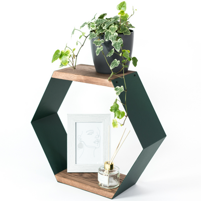
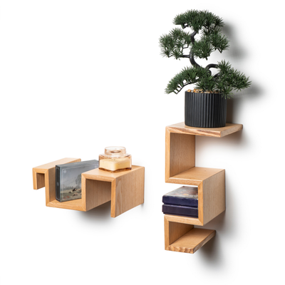
Products related to this article
Frequently asked questions
How high should a wall shelf be hung above furniture?
Leave enough breathing room between the shelf and the sofa, desk, or bed below it. When the gap is too small everything reads as one heavy block, while even slightly more distance makes the wall feel open and balanced.
Why does my room feel smaller after adding shelves?
Common causes are shelves hung too low or too high, too many shelves on one wall, bulky deep designs, or shelves blocking natural light. Placement mistakes add visual weight, and a few centimeters can change how a room feels.
Is it bad to hang shelves near the ceiling?
Shelves placed too high feel disconnected from the room and lose their function since items become hard to reach. Keep shelves within a comfortable line of sight so they relate to the furniture and layout.
How many shelves should I put on one wall?
Fewer than you might think. Too many shelves create visual weight and crowding, especially when each is filled. Thoughtful spacing and a limited number usually create a cleaner result, even with slightly less storage.
Should a shelf align with the furniture below it?
Yes, use the furniture as a reference point. A shelf that is slightly off-center or mismatched in width with the sofa below looks accidental; it should either align or contrast in a clearly intentional way.
What shelf size works best in small rooms?
Slimmer profiles and wall-mounted designs feel visually lighter. Thick, deep, or heavy shelves dominate the wall and make small rooms feel more enclosed.
Can shelves block natural light?
Yes. Shelves placed too close to windows or in the path of light create shadows and reduce brightness more than expected. Keep shelves away from main light sources or choose open, less bulky designs.
Does wall type matter when hanging shelves?
Absolutely. Drywall needs proper anchors or the shelf can loosen, tilt, or sag over time. Choosing the right fixings for your wall keeps the shelf stable and looking good long term; EWART WOODS shelves come with hidden mounting systems designed for secure installation.


Leave a comment